
Introduction to Web Design Mistakes
In today’s digital landscape, an effective web design is paramount for businesses striving to establish a strong online presence. A well-designed website serves as the virtual storefront for any organization, functioning as a critical tool for engaging potential customers and facilitating conversions. Conversely, poor web design can severely undermine the user experience, driving visitors away and diminishing the effectiveness of marketing strategies. Understanding the common web design mistakes is essential for creating a site that not only attracts users but also meets business goals.
Key elements of effective web design encompass usability, aesthetics, content organization, and responsive design. Each aspect contributes to how visitors perceive and interact with a website. When these elements are not harmoniously integrated, it may result in frustrating experiences that deter users from returning. For instance, a cluttered layout may confuse visitors, while slow loading times can lead to significant drop-offs, ultimately affecting the site’s performance and credibility.
In addition to user experience, common web design pitfalls can also negatively impact search engine optimization (SEO). Factors such as poor navigation, lack of mobile-friendly design, and ineffective use of keywords can hinder a website’s visibility on search engine results pages. This, in turn, affects the quality and quantity of traffic that a site attracts, further complicating marketing efforts.
Given the potential consequences of web design mistakes, engaging professional web design services can be invaluable. Experts in the field understand how to navigate the complexities of design and functionality, ensuring that a website not only looks appealing but also performs well on various devices. Investing in quality web design ultimately contributes to a stronger brand identity, better user engagement, and improved business outcomes.
1. Overcomplicated Navigation
Effective web design hinges significantly on the user experience, and one of the critical elements influencing that experience is navigation. Overcomplicated navigation can lead to confusion among visitors, detracting from the site’s usability and making it challenging for users to find the information they seek. When visitors encounter a complex navigation structure filled with excessive links, dropdown menus, and ambiguous labels, frustration often ensues. This confusion can result in users abandoning the site entirely, leading to a missed opportunity for engagement and conversion.
To improve navigation and create a more user-friendly experience, it is essential to adhere to best practices. Firstly, a clear, concise, and logical structure should guide visitors seamlessly through the website. Primary navigation should include only the most important categories, while secondary information can be housed beneath these main headings. It is advisable to limit the number of menu items to a manageable quantity; typically, five to seven main categories are ideal for ensuring that essential information is easily accessible.
Additionally, employing descriptive labels for navigation items is key. Users should be able to anticipate what content lies behind a link simply by reading the label. This clarity enhances their confidence in navigating the site and helps locate relevant information quickly. Implementing breadcrumbs can also aid navigation, providing users with a visual path to trace their steps and easily return to previous pages.
In contrast, utilizing search bars can further improve the navigation experience, allowing users who prefer a more direct approach to find specific content efficiently. Ultimately, simplifying navigation not only enriches the user experience but also encourages further exploration of the web content, fostering greater engagement and connection with your audience.
Lack of Mobile Responsiveness
As the usage of mobile devices continues to rise rapidly, the necessity for a responsive web design has never been more critical. Websites that are not optimized for mobile devices can significantly alienate a substantial segment of potential users. Statistics indicate that over half of global web traffic now comes from mobile devices, underscoring the importance of ensuring that your site provides an optimal browsing experience irrespective of the device used.
A website lacking mobile responsiveness often leads to frustrating user experiences. Elements such as text, images, and navigation menus may appear distorted or not function properly on smaller screens. This not only discourages visitors but can also lead to higher bounce rates, hindering the overall effectiveness of the website. Furthermore, search engines, including Google, have begun prioritizing mobile-friendly sites in their ranking algorithms. Failure to adapt to this trend can have detrimental effects on a site’s visibility and traffic.
To effectively address mobile responsiveness, designers should employ flexible grid layouts and scalable images. This allows content to adjust dynamically based on the screen size, ensuring that all users experience the site as intended. Additionally, implementing a design approach known as mobile-first design can streamline the development process. This strategy focuses on creating the mobile version of a site before expanding to larger screens, fostering a design that is inherently more mobile-friendly.
Moreover, it is crucial to conduct regular testing of the website on multiple devices and screen sizes to identify any user experience issues promptly. Utilizing tools such as Google’s Mobile-Friendly Test can provide valuable insights into how a website performs on mobile devices. By prioritizing mobile responsiveness, businesses can enhance user experience, improve engagement, and ultimately drive higher conversion rates.
Cluttered Layout and Design
A cluttered layout in web design can significantly hinder user experience, often leading to reduced engagement and increased bounce rates. When visitors are confronted with a chaotic design, their attention is drawn away from the content you wish to highlight, resulting in important information being overlooked. This distraction can lead to frustration and may deter users from exploring your website further. To enhance user attention and retention of information, it is crucial to prioritize a clean and organized design that effectively communicates your message.
One of the key strategies for creating an appealing design is the use of whitespace. Whitespace, or negative space, refers to the empty areas around design elements. This space is not merely “blank”; it serves to separate sections of content, giving users a visual break and helping them to navigate the site more efficiently. When designed properly, ample whitespace enhances readability and guides visitors’ eyes toward the most significant elements of the page, such as calls to action and critical information.
Another essential aspect of achieving balance in layout is the thoughtful arrangement of visual elements. A well-structured design ensures that images, text, and interactive features are placed harmoniously, rather than crammed together. This balance makes it easier for users to process information quickly and encourages longer visits. To avoid clutter, designers should adhere to a consistent grid layout that maintains uniformity across different pages. By limiting the number of colors, fonts, and design elements, and focusing on a limited palette, you can enhance the overall coherence of the site.
Ultimately, the goal is to create a visually appealing design that promotes ease of use and allows users to absorb information effectively. By minimizing clutter and strategically using whitespace, web designers can craft an experience that not only captures user attention but also cultivates a sense of satisfaction, leading to higher chances of conversion and retention.
Slow Loading Times
One of the most critical factors influencing user retention and search engine optimization (SEO) is the loading speed of a website. Research indicates that users often abandon websites that take longer than three seconds to load, leading to decreased user engagement and higher bounce rates. This not only affects the immediate user experience but also impacts the website’s ranking on search engine results pages (SERPs). Google has underscored the importance of loading times, integrating it as a key ranking factor in its algorithms. Therefore, reducing loading times can lead to better SEO outcomes and a more favorable user experience.
Common causes of slow website performance include unoptimized images, excessive use of scripts, and poor server response times. Large image files that are not properly compressed can significantly hinder loading speeds. Additionally, the use of too many plugins or scripts can result in increased HTTP requests, which ultimately slows down page rendering. Furthermore, inefficient coding practices can contribute to slower server response times, causing delays in website loading. Optimization efforts should focus on eliminating these roadblocks to facilitate faster loading.
To enhance site speed, website owners can implement a variety of strategies. First, compressing images and utilizing appropriate file formats can significantly reduce load times without sacrificing quality. Tools such as image optimization plugins for content management systems can assist in achieving this objective. Additionally, minifying CSS, JavaScript, and HTML files is an effective approach to decrease file sizes and speed up rendering. Employing a content delivery network (CDN) can also distribute site content across various locations, resulting in faster access for users worldwide. Lastly, regularly testing site speed through tools like Google PageSpeed Insights can help monitor performance and identify areas needing improvement.
5. Poor Content Organization
Effective web design goes beyond aesthetic appeal; it encompasses comprehensive content organization as well. A well-structured layout significantly enhances the user experience, guiding visitors easily through the site. Conversely, poor content organization can lead to user confusion, higher bounce rates, and ultimately, lost conversions. When users cannot readily find the information they seek, it diminishes their engagement and trust in the website.
The hierarchy of content is crucial in web design. It dictates how the information is presented, influencing ease of navigation and comprehension. A disorganized content structure can overwhelm users, leading to frustration. To avoid this, a clear hierarchy should prioritize essential information, ensuring that key messages are readily accessible. Utilizing headings, subheadings, and bullet points enables users to scan content more effectively, improving readability.
Moreover, creating a logical flow is fundamental in guiding users through the content. Start with an introduction that outlines what users can expect. Follow this with well-organized body content that provides detailed information, and conclude with a summary or call-to-action. This format not only enhances clarity but also encourages users to interact with the content more deeply.
Additionally, employing visual hierarchy through typographic variations such as font sizes, weights, and colors can direct attention to specific sections of content while maintaining a coherent design. Incorporating white space and limiting the amount of text per section also contributes to a more digestible user experience, reducing cognitive overload.
Ultimately, effective content organization fosters a sense of order and trustworthiness in web design. By implementing structured content, designers can create an engaging, user-friendly interface that guides visitors seamlessly through their online journey, enhancing both usability and overall satisfaction.
Use of Inconsistent Branding
Branding is a critical component of web design, as it contributes significantly to a company’s identity and the user experience offered on its platform. Inconsistent branding can dilute the strength and recognition of a brand, leading to confusion among users who visit the site. It is essential to maintain visual coherence across all pages to strengthen a brand’s presence and ensure a seamless experience for users.
One of the primary elements of branding is the use of specific colors, fonts, and imagery. When these elements are not uniformly applied throughout the website, it creates a disjointed impression, hindering the user’s ability to connect with the brand’s message. For instance, utilizing different fonts on various pages can lead to a perception of carelessness, making the website appear unprofessional. Consistency in design not only influences users’ perceptions but also strengthens brand recall, making it easier for customers to remember and return to the website.
Furthermore, the language and tone used across the site should reflect the overall branding strategy. If the messaging changes abruptly from page to page, it can leave visitors feeling uncertain about what the brand is trying to communicate. To uphold branding clarity, it is advisable to develop a comprehensive branding guide that outlines the use of logos, color palettes, typography, and voice. This guide serves as a reference for designers and content creators, ensuring that anyone involved in the web design process understands how to present the brand effectively.
In conclusion, consistent branding in web design is vital for creating a harmonious and recognizable online presence. By ensuring that visual and textual elements align, brands can cultivate trust and foster deeper connections with their audience, ultimately leading to enhanced user engagement and loyalty.
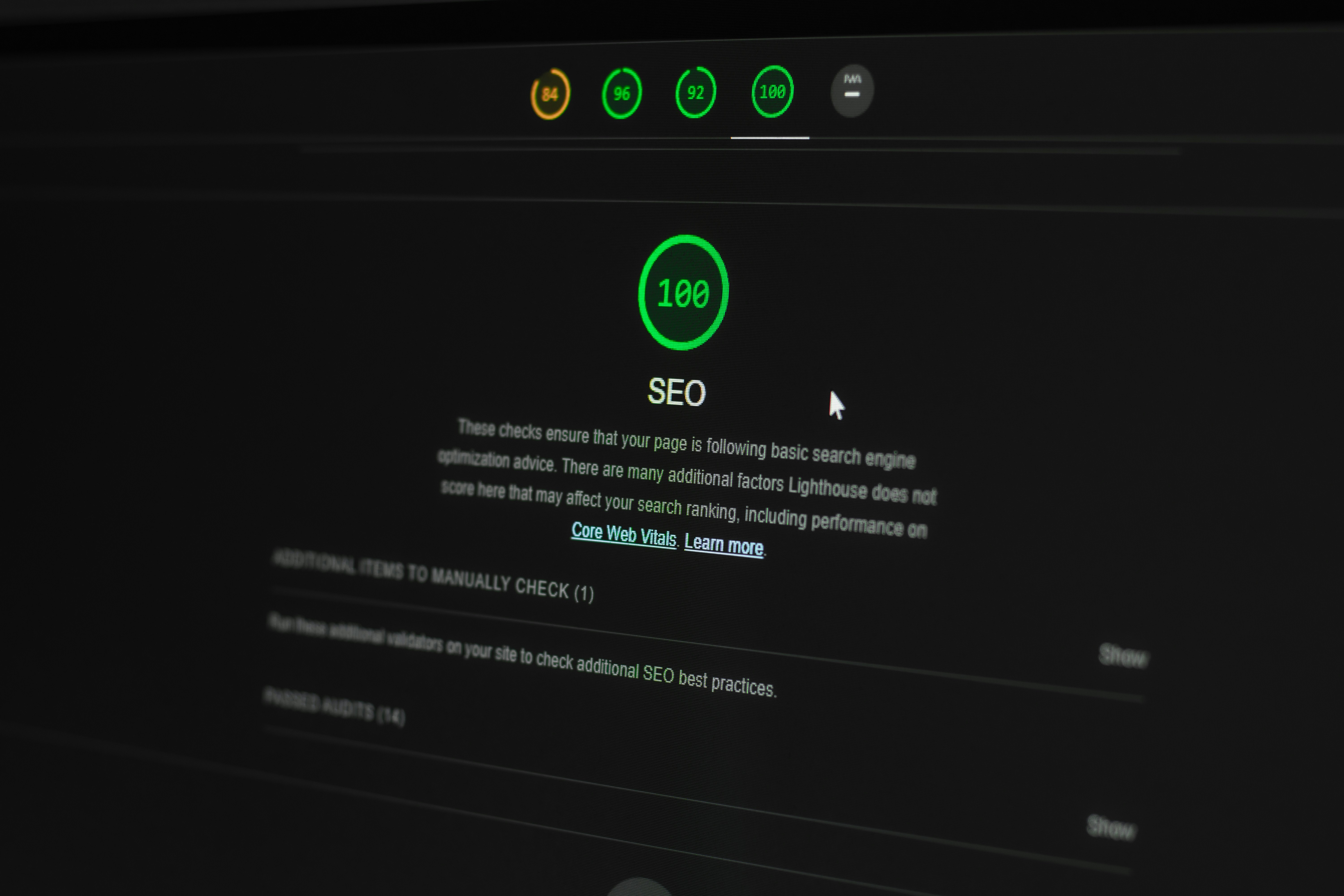
Ignoring SEO Principles
In the digital landscape, the connectivity between web design and search engine optimization (SEO) is often overlooked by designers and developers alike. Ignoring SEO principles during the design phase can significantly hinder a website’s visibility and overall traffic. Each web design element should be strategically planned with SEO in mind to ensure optimal performance in search engine results.
One prevalent mistake is the neglect of semantic HTML elements. Proper usage of headings (H1, H2, etc.), alt attributes for images, and structured data can enhance a site’s crawlability and indexability. Misusing HTML tags or using non-semantic code can lead to search engines misinterpreting the content, ultimately affecting the site’s ranking. Another common oversight is the failure to optimize page loading speed. Heavy, unoptimized images and faulty coding practices can lead to longer loading times, which not only deter users but also negatively impact SEO ranking factors.
Moreover, mobile responsiveness is critical in today’s web design. A website that is not optimized for mobile devices can lead to significant drops in user engagement and search rankings. Search engines, particularly Google, prioritize mobile-friendly sites in their algorithms. Thus, neglecting to design with mobile users in mind may limit a site’s audience and accessibility.
Finally, keyword integration is essential in both content creation and design. Incorrect placement of keywords or reliance on non-optimized content can severely halt a website’s ability to rank well in search results. By incorporating SEO-friendly practices into the web design process, designers can create a platform that not only attracts visitors but also ensures they have a seamless user experience. A well-structured, SEO-optimized website can enhance visibility, drive traffic, and ultimately contribute to its success.
Ignoring Accessibility Standards
Accessibility in web design is an essential aspect often overlooked by many developers. Failing to adhere to established accessibility standards can inadvertently create barriers that prevent individuals with disabilities from fully engaging with a website. Such oversight not only alienates a portion of the user base but may also lead to legal repercussions for businesses that do not comply with the Americans with Disabilities Act (ADA) and other relevant regulations.
Common mistakes that exacerbate accessibility issues include the use of poor color contrast, which can hinder readability for users with visual impairments. For instance, text placed over a busy background without adequate contrast can make it difficult for users to decipher content. Additionally, neglecting keyboard navigation is another significant flaw, as many individuals rely on keyboard shortcuts instead of a mouse to navigate digital interfaces.
Another frequent error is failing to provide descriptive alt text for images. This practice is crucial for visually impaired users who utilize screen readers. When alt text is absent or not descriptive, these users miss out on important context and information. Moreover, reliance on audio or video content without captions or transcripts can exclude deaf and hard-of-hearing individuals from accessing vital content. Ensuring that all multimedia elements have a textual equivalent promotes a more inclusive experience.
To foster an inclusive web environment, web designers should follow the Web Content Accessibility Guidelines (WCAG), which provide comprehensive recommendations for making web content more accessible. Techniques like providing clear headings, using simple language, and offering multiple ways to access information can greatly enhance usability for everyone. By prioritizing accessibility during the design process, businesses not only expand their audience but also demonstrate a commitment to inclusivity.
9. Disregarding User Feedback
In the realm of web design, user feedback serves as a critical compass for guiding the development process. Failing to incorporate insights gathered from users can lead to repeated mistakes and ultimately result in an unsatisfactory experience. User feedback encompasses all forms of responses from real individuals who interact with the website; this includes surveys, usability testing sessions, and direct comments. Such insights are invaluable, as they enable designers to gain a deeper understanding of user expectations and preferences.
The primary reason for disregarding user feedback lies in the misconception that designers instinctively know what users desire. While professional designers possess significant expertise, this knowledge can only take them so far. Users are the ones who navigate the site, and their experiences often reveal unforeseen frustrations or challenges. Ignoring these insights can bring about design flaws that decrease user engagement and overall satisfaction.
To effectively integrate user feedback into the web design process, organizations should establish a systematic approach to collecting and analyzing this information. Regular usability tests can provide valuable data on how users interact with various design elements. Additionally, employing tools such as heat maps can highlight areas that attract attention or cause confusion. Designers should not only gather feedback but also actively listen and respond to it. By prioritizing user needs, designers can refine their projects based on real-world input, which significantly enhances the overall effectiveness of the website.
Moreover, facilitating open channels of communication with users can foster a sense of community and loyalty. Users are more likely to engage positively with a website that reflects their needs and preferences. Therefore, considering user feedback as an integral aspect of web design will fortify the overall quality of the design process and result in a more user-friendly product.